
All Posts
UI/UX Design 2026: Every Principle, Real Business Payoff, and Myth Ranked
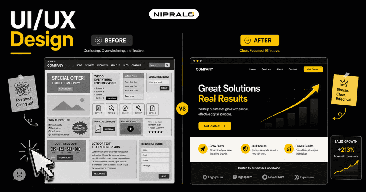
People decide whether they trust your website in under a second. Before they read a word.
That is not an opinion. It is how the brain works. A visitor lands, takes in the layout, the spacing, the colours, and forms a gut judgment almost instantly: this looks legit, or this looks off. If it looks off, they leave. You never find out why. Your analytics just show another bounce.
That is what design does, long before anyone thinks the word "design". It is not decoration you add at the end. It is the thing that decides whether the sale happens at all. This post covers what UI and UX actually are, the principles that drive real results, and the myths that cost businesses money.
UI vs UX, the difference in plain terms
People use these two terms as if they mean the same thing. They do not.
UX, user experience, is the whole journey. Can the visitor find what they came for? Is the path to buy clear? Does the form make sense? UX is about how it works.
UI, user interface, is what they see and touch. The buttons, colours, fonts, spacing, layout. UI is about how it looks and feels under the finger.
A simple way to remember it
Think of a restaurant. UX is whether the menu is easy to read, the food arrives fast, and you can find the toilet. UI is the plating, the lighting, the design of the menu itself. You need both. Beautiful plating on a two-hour wait is still a bad night out.
Here is the split laid out.
How UX design affects business results
Good design is not a cost. It is one of the highest-return investments a business can make, and the numbers back it. Forrester's widely-cited research puts the return on UX investment at roughly 100 dollars for every dollar spent. Verify the exact figure, but the direction is not in doubt: design pays.
Here is where it shows up on your side of the ledger.
- More conversions. A clear path from landing to checkout means more visitors finish. Confusion at any step leaks customers.
- More trust. People judge credibility largely on how a site looks and works. A clean, professional design makes them comfortable handing over money.
- Lower support cost. When a product is easy to use, fewer people email you confused. Your team spends less time explaining and fixing.
- Higher retention. People come back to things that feel effortless. They avoid things that made them work.
A real example
A services business in Bengaluru came to us with a site that looked fine but converted poorly. The problem was not the visuals. It was the flow. The "contact" step was buried three clicks deep, the form asked for too much, and nothing told the visitor what happened next. We cut the form, pulled the call-to-action up, and made the next step obvious. Same traffic, more enquiries. Nothing about the marketing changed. Only the experience did. This kind of work sits at the centre of our design and development approach.
The principles that make design "good"
Good design is not about looking impressive. It is about getting out of the user's way. A few principles do most of the work.
Clarity beats clever
If a visitor has to think about how to use your site, the design has failed. The best interfaces feel obvious. The button looks like a button. The next step is where you expect it.
Consistency builds trust
Same buttons, same spacing, same language across every page. Consistency tells the brain the site is reliable. Random changes make it feel improvised and unsafe.
Less is more
Every extra field, link, and option is another decision you force on the visitor. Strip the page to what matters. The clearest sites are usually the emptiest.
Design for the phone first
Most of your visitors are on a small screen with one thumb. If it does not work well there, it does not work. Full stop.
Here is how these principles map to the result they drive.
Design myths that cost businesses money
Some beliefs about design sound sensible and quietly drain money. Worth naming them.
- "Pretty equals good." A gorgeous site that confuses people is a failure. Looks are UI. Results come from UX. You need both, but never mistake one for the other.
- "Design is the last step." Bolting design onto a finished build is expensive and rarely works. Good experience is planned from the start, not painted on at the end.
- "We can copy a template and be fine." As AI tools flood the web with lookalike template sites, doing exactly what everyone else does is now the fastest way to blend in and be forgotten. Real UX thinking is the differentiator.
- "Our customers do not care about design." They care intensely. They just do not call it "design". They call it "this site is confusing" and leave.
How to measure the ROI of design
You do not have to take design on faith. Tie it to numbers you already track.
- Set a baseline. Record your current conversion rate, bounce rate, and average enquiries before any change.
- Change one thing at a time. Redesign the checkout, or the contact flow, or the landing page. Not all three at once, or you learn nothing.
- Measure the same metric after. Compare conversions and bounce on the same traffic. The delta is your design ROI.
- Watch support volume. Fewer confused emails after a redesign is real money saved, even though it never shows up as revenue.
For the deeper craft behind all of this, the Nielsen Norman Group is the reference source, and you can see the range of what we build on our services page.
The short version
UI is how it looks. UX is how it works. Good design is not decoration you add at the end, it is the thing that decides whether a visitor trusts you, stays, and buys. The payoff is measurable: more conversions, more trust, lower support cost. Skip it and you lose sales you never even see. Start with one flow, measure it, and let the numbers make the case.
Is your design quietly costing you sales?
Book a free 20-minute call. Our team will look at your site's flow and design and tell you straight where you are losing customers and what is worth fixing.
Frequently Asked Questions
What is the difference between UI and UX design?

UX design is about how a product works: the flow, structure, and whether users can do what they came to do. UI design is about how it looks and feels: the colours, fonts, buttons, and layout. UX is the journey, UI is the surface, and a good product needs both.
How does UX design affect business results?
Good UX increases conversions by making the path to buy clear, builds trust so people feel safe paying, and lowers support costs because fewer users get confused. It also improves retention, since people return to products that feel effortless to use
Is good UI/UX design worth the investment?
Yes. Forrester's widely-cited research puts the return on UX investment at around 100 dollars for every dollar spent. Even setting the exact figure aside, better design consistently lifts conversions and trust while cutting support load, which makes it one of the highest-return improvements a business can make.
What makes a website design "good"?
Good design is clear, consistent, simple, and works well on a phone. The next step is always obvious, the look stays the same across pages, only what matters is on the screen, and it is usable with one thumb on a small screen. Good design gets out of the user's way rather than showing off.
How do you measure the ROI of UX design?
Set a baseline for your conversion rate, bounce rate, and enquiries first. Then change one thing, such as the checkout or contact flow, and measure the same metric on the same traffic afterward. The difference is your design ROI. A drop in confused support emails is also real money saved.